How to Streamline Your Presentations and Stand Out at Work


At 26, I was responsible for many marketing materials and presentations for a mid-sized fixed-income hedge fund. As is typical for many financial and consulting firms, these presentations contained phenomenal content with little consideration for aesthetics or brand consistency. I took great interest in streamlining these materials and creating a more uniform brand message with every presentation. Thus, the idea that would later become di8it – a new web application that extracts data from chart images – was born.
Getting a Leg-Up
Standing out as a new consultant, financial analyst, or other business professional can be challenging, particularly in the current hypercompetitive market. When you start working, you can create presentations and reports, providing an excellent opportunity to distinguish yourself from your peers. These presentations typically use charts and diagrams from outside research, and employees will often haphazardly slap these together so that they are inevitably challenging to read, ugly to look at, and inconsistent with their company’s. So, if you put in some extra effort to create superior, homogenous presentations, you’ll get a leg up.
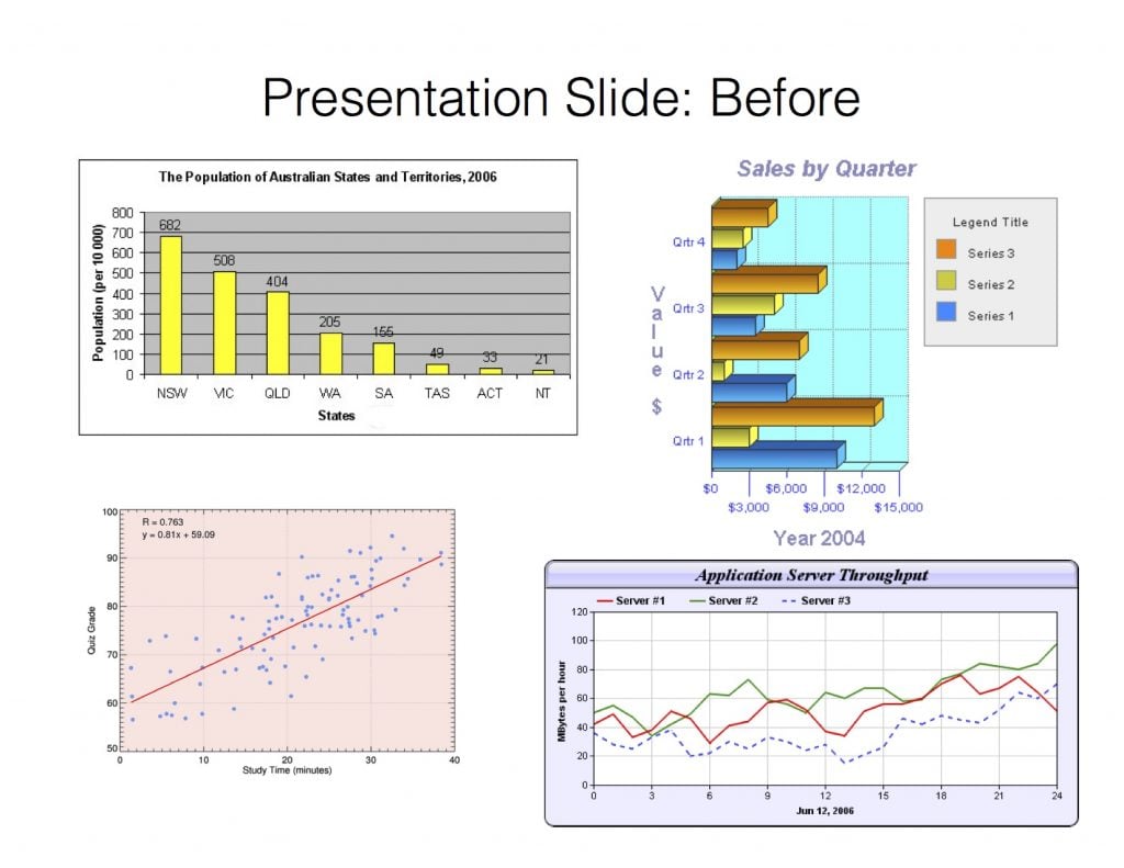

Which looks better: the PowerPoint slide on the left or the right? Although both utilize the same data, the right slide looks significantly more professional and indicates that the creator cares about the image that she and her company project.
Game-Changing New Software
The left slide isn’t available at many large consulting firms. At these companies, you are always required to create uniformly branded presentations for your clients: if you can’t change the format of a chart, you can’t change it. In the past, there were only a few sub-optimal ways to achieve this:
- Track down the data from the source (often not possible)
2. Manually estimate the data yourself (a painful and imprecise process)
3. Outsource the work to a separate research group (likely with significant lag time and a hefty price tag)
Now, with di8it, you can upload an image of a chart from a PDF or website and immediately get the raw data to analyze or re-format. Because it is easy to use, di8it can save you enormous money and significantly improve your presentation-making process.
Simple Rules for Making Better Charts
Once you have the data, you can create a new chart in any format you’d like using your favorite spreadsheet program, such as Microsoft Excel. Typically, your firm will have some rules for chart formatting, but if not, here are some of my basic guidelines for understanding data visualization:
1. Choose an Appropriate Chart Type
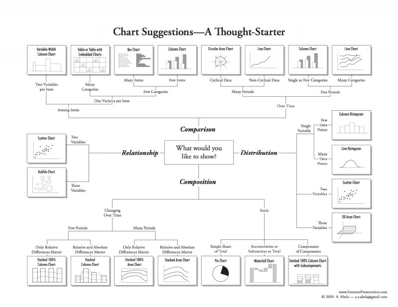
Sometimes, the original chart type is not the best way to display the information. Once you have the raw data from di8it, you can use this diagram from Extreme Presentation to choose the optimal chart type.

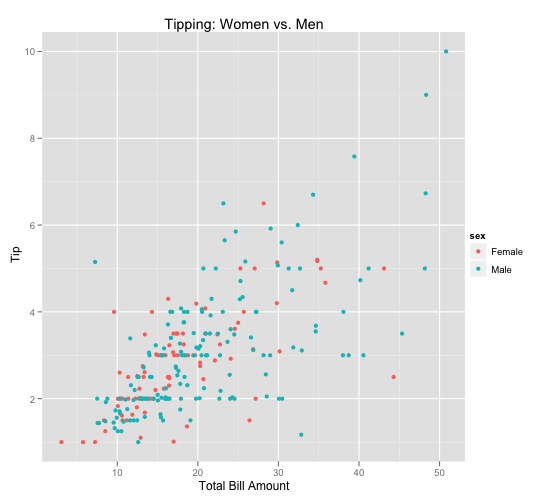
2. Remove Clutter
Remove gridlines or make them as subtle as possible unless they’re essential. The same goes for unnecessary axes lines, legends (e.g., when there is only one series), and borders. These elements typically take away from the actual data and make your charts harder to read.
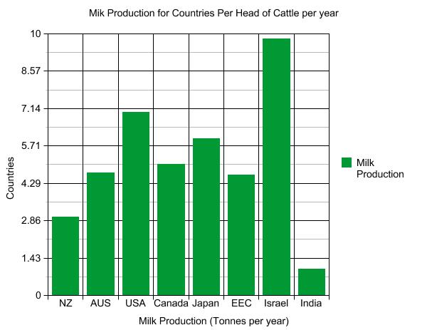

Before After
3. Use Proportional Font Sizes
If you’re using a slideshow to present to an audience, make sure the font is no smaller than 18 pts so the charts are legible from a distance. Also, avoid any overly elaborate font styles such as scripts or heavy boldfaces.
4. Use Minimalist Number Formats
The numbers for your axes lines and data labels should be easy to decipher: 20,000 is better than 20000, 35% is better than 35.00%, and 0.7 is better than 0.7123.
5. Make It Obvious
Your point should be almost immediately apparent to the person reading the chart. Sometimes, this means splitting one chart into two, adding trendlines, or combining series that aren’t (e.g., pie charts should not have more than five slices). Because you have the underlying data, you can quickly improve the original design.

Source: https://www.r-bloggers.com/my-five-rules-for-data-visualization/
These small changes can make an enormous difference in the overall appearance of your presentations and reports. When embarking on a career as a business professional, it’s essential to project an image of thoroughness, demonstrate superior attention to detail, and indicate that you care about the company and its brand. Creating visually appealing, streamlined presentations is a simple and effective way to stand out at work.